

A chart pattern is a shape in a price chart that helps indicate what might happen next. In my previous article on candlestick patterns, I explained some smaller chart patterns that traders should know. In this article, I will explain the anatomy of larger candlestick patterns that will help you understand what you should look for in charts as you do your technical analysis.
Head and shoulders
Head and shoulders is a trend reversal chart pattern with a large peak flanked by two smaller peaks. Traders look at head and shoulders patterns to find reversal signatures.
Typically, the initial and last peak will be smaller than the second (middle peak), but they will all fall back to the same level of support, known as the ‘neckline’. A bearish downtrend is probable once the third peak breaks below the support level or neckline.
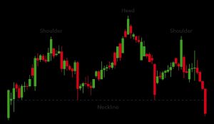
By simply turning the chart above upside down you can observe how an inverse Head and Shoulder pattern forms.
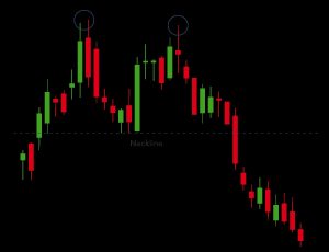
Double top
A double top is a pattern traders use to spot potential trend reversals. Typically, an asset’s price will experience a peak, before retracing back to a level of support. It will then proceed to rally once more before reversing back more resolutely against the prevailing trend.
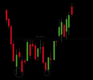
Double bottom
A double bottom indicates a period of selling, causing an asset’s price to mark down below a level of support. It will then rally to a level of resistance, before marking down again. Eventually, the trend will reverse and begin moving up as the market becomes more bullish and buyers keep coming in at higher prices.
A double bottom is bullish because it signifies the end of a downtrend and a shift towards an uptrend.
Rounding bottom
A rounding bottom chart pattern can herald a continuation or a reversal. During an uptrend, an asset’s price may fall back slightly before rising again. This is a bullish continuation.
An example of a bullish reversal rounding bottom – shown below – would be if an asset’s price was marking down and a rounding bottom formed before the markdown reversed and started marking up.
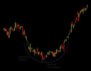
Traders will try to take advantage on this pattern by buying halfway around the bottom, at the low point, and profiting from the continuation once it breaks above a significant level of resistance.
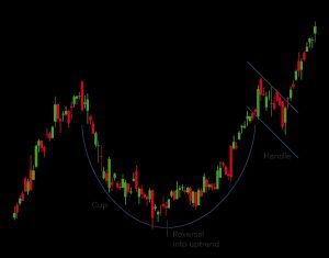
Cup and handle
The cup and handle pattern is a bullish continuation pattern that shows a period of bearish market sentiment before the prevailing bullish trend continues. The cup looks similar to a rounding bottom chart pattern, and the handle is similar to a wedge pattern, which is explained later in this article.
Following the path of the rounding bottom, the price of an asset will probably enter a temporary retracement, which is known as the handle because this retracement is confined to two parallel lines. The asset will eventually reverse out of the handle and continue with the bullish trend in the background.
Wedges
Wedges form when asset’s price movements are confined between two sloping trend lines. There are two types of wedge: rising and falling.
A rising wedge is represented by a trend line caught between two upwardly slanted lines of support and resistance. In this case, the line of support is steeper than the resistance line. This pattern typically signals that an asset’s price will eventually decline more permanently, which is demonstrated below when it breaks below the support line.
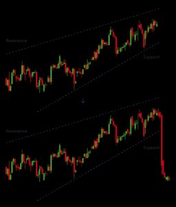
A falling wedge is simply the inverse version of the rising wedge, as shown in the example below.
Both rising wedges and falling wedges are reversal patterns, representing a bullish market and a bearish market respectively.
Pennant or flags
Pennants or flags are shaped, as can be deduced from the name, like actual flags. They are created after an asset’s price goes through a period of upward movement, followed by a consolidation. Typically, there will be a significant increase during the early stages of the trend, before it enters into a series of smaller upward and downward movements.
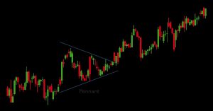
Pennants can be either bullish or bearish, and they can also represent continuations or reversals.
Pennants may appear to be similar to a wedge or a triangle pattern – explained in the next sections – it is important to note that wedges are narrower than pennants or triangles. Also, wedges always ascend or descend, while a pennant is always horizontal.
Ascending triangle
The ascending triangle is a bullish continuation pattern that signifies the continuation of an uptrend. Ascending triangles can be highlighted on charts by placing a horizontal line along the swing highs – the resistance – and then drawing an ascending trend line along the swing lows – the support.
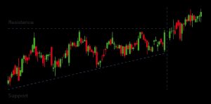
Ascending triangles often have two or more identical highs (peaks) connected by the horizontal line. The trend line signifies the overall uptrend of the pattern, while the horizontal line indicates the historic level of resistance.
Descending triangle
A descending triangle signifies a continuation of a downtrend. Traders will try to enter a short position in a descending triangle to profit from a falling market.
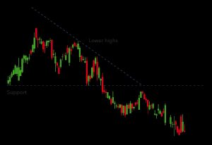
Successive lower peaks are likely to be prevalent and unlikely to reverse in descending triangles. They can be identified from a horizontal line of support and a downward-sloping line of resistance. Eventually, the trend will break through the support and the downtrend will continue.
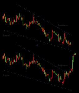
Symmetrical triangle
The symmetrical triangle pattern can be either bullish or bearish, depending on the market. In both cases, it is a continuation pattern that is usually followed by a continuation of the previous market direction.
Symmetrical triangles form when the price converges with a series of lower peaks and higher troughs. In the example below, the overall trend is bearish, but the symmetrical triangle shows us that there has been a brief period of upward reversals.
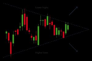
The caveat is that if there was no clear trend before the triangle pattern forms, the market could break out in either direction. This makes symmetrical triangles a bilateral pattern – meaning they are best used in volatile markets where there is no clear indication of which way an asset’s price might move. An example can be seen below
Chart patterns summed up
The chart patterns described in this article are very useful if used in the correct context. Finding trade setups is aided by adding knowledge of these pattern formations to an in-depth understanding of the markets you trade as well as sound risk management.

Leave a Reply